As we all know we have our final evaluation of our GSOC project next week. I have completed my project and would like to display how the integration between Cantor and LabPlot works. For this demonstration I will be using Python3 and numpy.
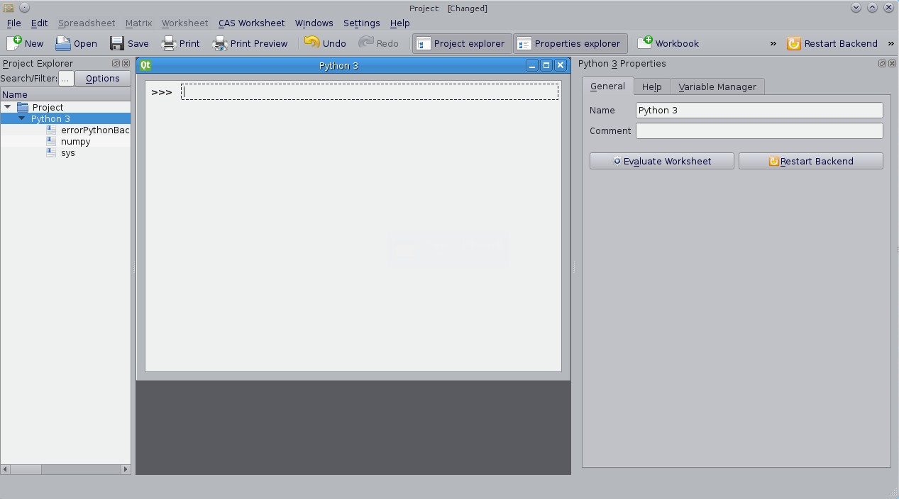
Let’s first create a Python3 session inside LabPlot.
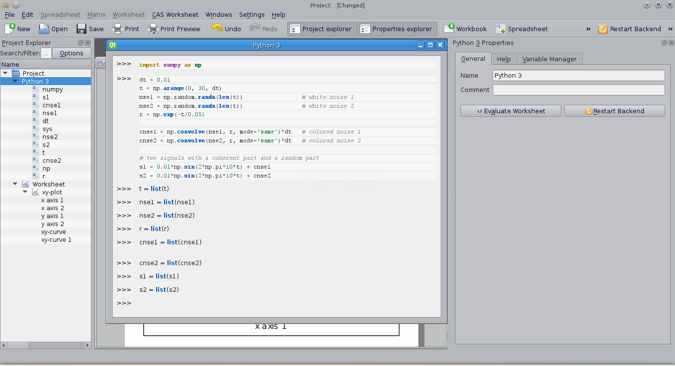
I will be referring to the script from here. So let’s execute the script and transfer every variable to lists as LabPlot for now supports only lists and tuple data structure. The screenshot bellow shows the final script when written.
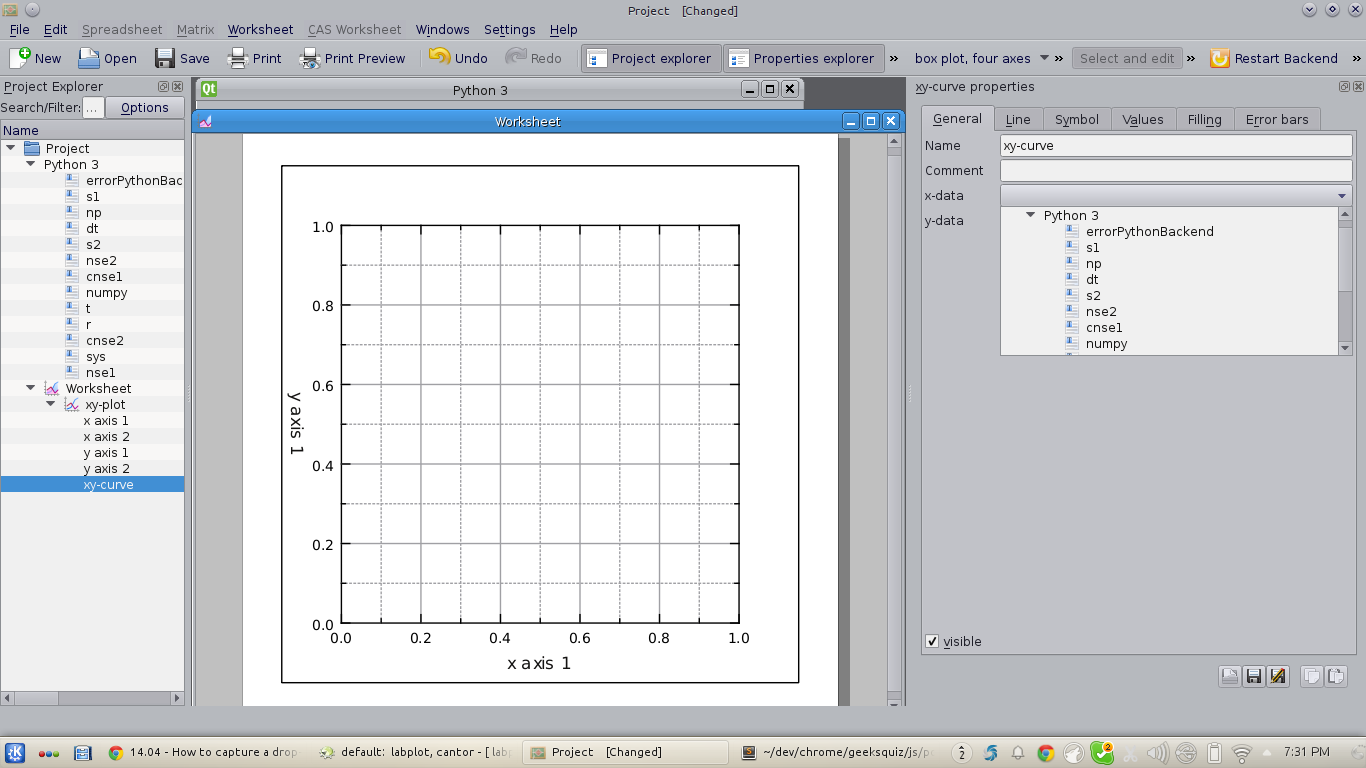
Every variable that is either list or tuple is converted to a column inside LabPlot which are child objects of the main CAS Session. These columns can then be used to generate plots as shown below:
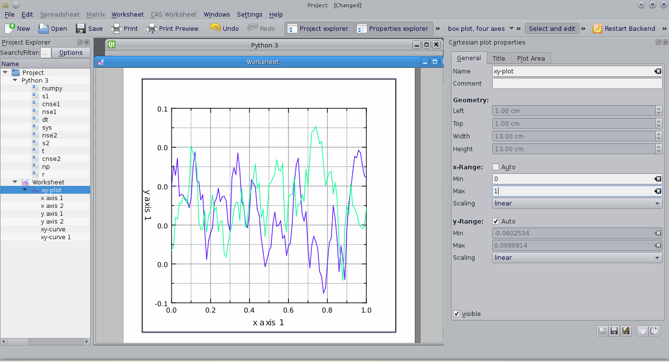
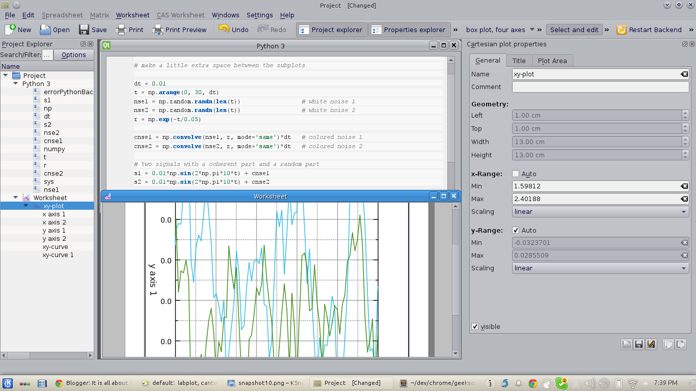
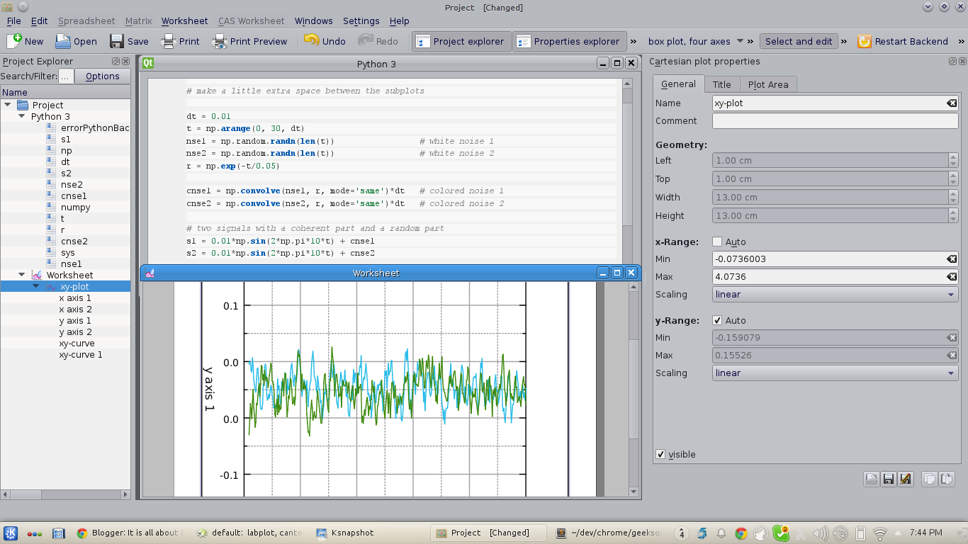
Finally, we chose the columns/variables we want to use and plot the graph. The following graph is generated if we plot “t vs s1” and “t vs s2” columns from the above data:
I have created parser, that is used to parse the variables to columns, for every backend, but testing for Sage and R backend is left. I will be testing those two parsers extensively during this week.
Below are some more screenshots showing zoomed in and zoomed out plots.
Moreover, user can now save all the data of the session as well as the plots inside one LabPlot’s .lml file and it can be loaded to be used next time user want. I hope with integration of the two applications, user experience of the users will increase and they will have a richer experience while ploting and using CAS .